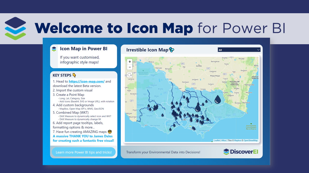
Working across the environmental industry – it’s fair to say that pretty much ALL of DiscoverEI’s Power BI reports have a map! And if you thought that MapBox was good, well you’re going to LOVE the Icon Map custom visual in Power BI – which allows you to display interactive polygons, points, lines and of course – icons, all in the one visual…plus so much more! To really appreciate how Icon Map can be used to visualize real world data, in this video blog I walk through two real-world applications of Icon Map to visualize environmental data. A big shoutout and thanks to James Dales for creating this awesome visual!!
Read MoreIn December, we were privileged to have Brian Julius, the Chief Content Officer at Enterprise DNA and Sam McKay the CEO and Founder at Enterprise DNA present a review of the Environmental Power BI Challenge Showcase.
Enterprise DNA has been running real-world Power BI Data Challenges for the past two years, but November 2021’s challenge was the first focused on environmental data. Entrants were asked to analyse unmasked data on environmental indicators in the U.S. mid-Atlantic region dealing with precipitation, contaminant exposure, and adult and child asthma prevalence. In this session, Sam and Brian reviewed the top entries, from an analytical, visualization and data storytelling perspective, and discussed some of the unique aspects of this challenge and lessons learned compared to past competitions.
You can learn more about Enterprise DNA and the environmental challenge competition here:
- Enterprise DNA: https://enterprisedna.co/
- Challenge Showcase: https://enterprisedna.co/power-bi-showcase
In the second meetup session for 2021 we jumped right into Data Visualisation!!. We hope you enjoyed the session and learnt a few things about DataViz techniques, tips and tricks!
Read MoreIn the first meetup session for 2021 we took a look at maps, both within Power BI and in Carto. Alice Drummond (DiscoverEI) introduced us to James Dales' Icon Map and the wonderful functionality we have built into it, before Idris Syed (City of Melbourne) introduced the MapBox API and how to use it. Lastly we had Chandni Gupta (Mosaic Insights) provide a great demo on how to use the Carto mapping platform, where she built from scratch a really cool example!
We hope you enjoy it and learn a few things about mapping options out there!
Read MoreIn this post we explore the key takeaways from our third Power BI and Data Analytics for Enviro’s Meetup Event, held in December 2020. This session was all about Power BI custom visuals and how we can use them to visualise our environmental data.
We would like to thank our presenters and all those people that dialled in to learn some awesome Power BI design tips, and practical examples of how to use Power BI custom visuals.
Read MoreIn this post we unpack the key takeaways from our second Power BI and Data Analytics for Enviro’s Meetup Event. This session was all about water industry applications for using Power BI and included presenters from CSIRO, the Water Corporation in Perth and Waikato Regional Council in New Zealand.
We would like to thank our presenters and all those people that dialled in to learn practical examples of Power BI is being applied across the environmental sector.
Read MoreIn this post, we share some of our favourite Power BI resources and learning materials. Whether you’re working in Power Query, with DAX, visualisations or in the online service, this comprehensive list can help you get the information you need.
Read MoreIn this post we unpack the key takeways from our Power BI for Enviro’s Meetup Launch Event, such as creating real-time online reporting for water sensors, creating a public communication tool for the COVID-19 Water Security Risk Index, and streamlining data processing and analysis of environmental data. Learn more and re-watch the video here! Thanks to our presenters: Alice Drummond & Christian Borovac (DiscoverEI), Jarrod Gaut (Water_Insites) and Lachlan Guthrie (International WaterCentre).
Read More